My first reason for changing the first design was that it was not compatible with "Flex" printing. The simple way to explain it is that sections of a vector design have to be at least 0.06x0.06 inches big, and spaces in between sections need to be at least 0.04x0.04 inches big. Obviously (or not, just from looking at it), the first Brand design did not meet the criteria, so a redesign was in order.
The way I tackled it was pretty simple, and looking back, I could have probably gone with a thinner type face, since the type I went with was definitely much wider than 0.06 of an inch. Anyhow, I opened the design with the original spider by itself in Illustrator, took the eraser tool sized to a circle approximately 0.04 of an inch wide, slashed through the divisions already in place on the body and legs, joined the fangs with the thorax (as well as for making the points of the fangs hang downward), got rid of the eyes, and made leg sections thicker were needed, mostly near the ends. To finish, I then joined it with a thicker font and left the store URL out (font that small would obviously not fit withing the 0.06 inch width).

An aside, and something that doesn't really matter now (you'll see when I show you the final revision), was something else that my friend Cindy pointed out to me. She was reading the brand out as *JUNIOR* Davila, while I meant it to be read as *Jey-Ahr* Davila. When I told her this she went "But you ARE a Junior!", "That doesn't matter, it's supposed to be my first and middle initials!", "What, R****?", "Don't call me that!"
*Ahem!*... So, yes, that's why I'm not signing off as "JR" anymore, either. Moving on...
Fast forward two months (like 3 weeks ago) and I got some time to sit down and hash it out! Plugged my tablet in, opened up the original spider design, selected the pencil tool set to fill all strokes and went at it! It took me longer than I'd rather admit, so I'll just skip to it and show you the finished result!
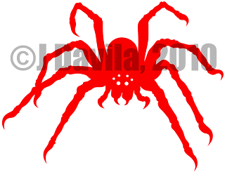
It's beautiful!...in, uh, it's very own, disgusting, creepy, arachnid kind of way (gag). And I was even able to add in (or would that be subtract out?) some eyes for it! That's one of my favorite parts about it. I'm going to post an update later with some of the doodles that I made while still trying to decide what my brand would look like, and explain the significance of the six eyes then.
Y'know what though? I'm surprised it took me all the way until this post to start mentioning Cindy, since she seems to be one of the only other artist critiquing my designs before, (more on that later) during, and after my creative sessions. So far, she's been the only person to question my choice to go with six eyes instead of eight. Of course, I quickly explained to her that some spiders have even less. Besides that she loved it though! She didn't actually see it until I was already wearing it on my "GI 1911 RELOAD! 1.0" tee. It rides right on my left shoulder blade on that t-shirt. She liked it so much that she wants me to get her something with just the spider on it though. She thinks it's "cute" (I strongly disagree that anything with 8 legs is cute, but...).
As far as usage for this brand design goes, as I mentioned before, it will be just for promotional purposes, so it will only go on t-shirts that I order for myself or for friends. I'll also be making PNG versions to coincide with any digital direct designs, and those will contain the shop URL in a crescent path around the spider.
That seems like just about everything I wanted to say about the brand for now. Keep a look out for the next post, when I'll return to muse about my "RELOAD!" design. It'll be a good one, I promise! Y'all carry on now.
J, out!
No comments:
Post a Comment
Brevity and Civility