Showing posts with label Cindy. Show all posts

October 16, 2011

Next Needs Up: The Origins

(Some needs must be met, as some origins must be known...)

This post has been coming for a long, LONG time. Not only that, it's been a while since my last post. I've actually been sitting here and reading back through some of them in an effort to get myself back into the groove of it, so please bear with me.

This is a tale of a creature  that was born in the depths of my subconscious. How it got there is somewhat mysterious. But even more mysterious than that, is why it got its name. That is something that in all honesty, I am still unaware of to this day, and I am almost certain that it is a question that I will never be able to answer. Its name is "Next Needs Up"...

Click image for larger version
I cannot say exactly when it came into being, since I do remember there being prior instances of me drawing it which I do not have on hand, but the drawing on the cover of this notebook, which I began to use for a "Contemporary Ethics" class in early October of 2009, is the earliest recorded instance of its appearance that I have available. This "face" came from a smiley that I began using regularly around that time. Some of the girls in school and I would text back and forth a whole lot back then, and we'd always invent these crazy looking smileys. The one that this creature came from is ":E". As you can see, it's got the beady eyes, and the distinctive three fangs.

The next known instance is found as a doodle on a loose sheet of paper with all sorts of scribblings on it. The presence of a doodle labeled "duodenum" on this page leads me to believe that it was all done during "Intro to Human Anatomy", which I was taking during the same quarter as the aforementioned ethics class. Those doodles and scribbles are how Cindy and I communicated (don't ask) during many of our classes, hers being in pencil and mine in ink in this example. As you can see (as if I hadn't make it plainly obvious), the creature is present again, and with a whole body this time. The changes that it has gone through up to its final iteration are not many. It is basically more rectangular now, as seen in this instance (whose original file I cannot find) found on my Facebook, dated November 22, 2010.

Now that Next Needs Up's (Adlyn and I began calling him "Next" for short.) physical origins have been explained a little, I'd like to get to the subject of its name. The mystery surrounding this is something that interests me greatly, since my curiosity for it will never end, and it has probably given Next a lot of appeal for me. Just the origin of its name is something that has pushed it into being a character that I will continue to proliferate, maybe in hopes of growing to understand it. Anywho, on to the name...

Click image for larger version
It was a chilly night, and I was having many, many drinks with friends. The occasion: My friend Adlyn had lots of left over alcohol, and she enlisted my help to try and get rid of it...properly. In the morning, while we were all sitting around eating breakfast and laughing about the previous night, she showed me something that I had doodled the night before, and she was laughing at how strange it was. It was on a page on the very back of one of her school books, and it is the image you see to the right.

This...confused me. A lot.

(I'd like to note that I just took a break from typing to stare at the drawing, laugh a whole lot, and to yell "What does it mean? What does it MEAN!?" It is truly baffling...)

So I just looked at her as if to say "What the fuck is this?!" From top to bottom, you have some crazy monster thing (as I named it) with the words "basic needs" in parenthesis. Next down the line, you have my recurring character, which I labeled as "next needs up" in parenthesis. But what does that mean? If it is the next needs up from the previous...thing, which I labeled basic needs, then why is it below it in line? Was I referring to Maslow's hierarchy of needs? And if so, does that mean that I meant for it to be a physical manifestation of the "safety needs"? But why would it look like some monster/demon thing? UUGGGHHH!... Next down the line, is some...really stupid looking thing, which I labeled as "wut?" in parenthesis. Yeah...exactly. (Interesting to note is that these three, if looked at from top to bottom, have progressively less fangs showing from one to the next. Wonder what that could mean...)

I was positively blacked out while I drew this so, of course, I have no idea why I drew any of it, and lack any recollection of what was going on in my head, or around me, during this time. So, after a moment of inspecting it some more, I began to ask her questions. "Why did I draw this?" She didn't know. "Well, what were we talking about?", "Nothing. You were just laying down the moment before." "Well...was I saying anything?!", "No. You just dragged the book over to you, pulled out your pen, and started drawing without saying anything..."


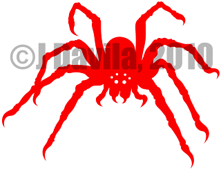
Fucking. BAFFLED! It's, like, the perfect mystery! I could try to attribute some kind of meaning to this, but it would just be a lie. I have no freaking clue! So, that day I just decided, "Well, I guess that's his name! Next Needs Up!" and Adlyn and I have just run with it ever since. I kind of love it now! Hell, I feel safe in stating that I am as obsessed with Next Needs Up as I am with spiders and my own arachnophobia. (And hilariously enough, here is a merging of both!)

Since this post has run a bit longer than I anticipated (really now?), I will be turning it into its own post, and linking posts which contain Next Needs Up related designs back to it, for anyone who cares to read about its messy origins. Thanks for reading this far. I know it's a lot of craziness to read through. Until the next time, take care of yourselves, and carry on!

J, out...

July 20, 2010

Danger & Beauty: Last Half

(Surprise surprise?)

I swear I wasn't trying to fake anyone out when I posted this just yesterday. I actually didn't expect to start up on this until like, at least, a few more weeks. But!...circumstances have presented themselves that have allowed me to sit and prepare this post. So....let's wrap this two parter up!

In the first half, I went into some personal philosophy and over the process that spawned the girl in this 3 part design. So let's discuss the next design in the compilation. In truth, this was actually the first design of the three which I undertook, and the one which I thought would be the more complex of the three; the gun. As you might know from some of my past blogs, I'm kind of a fan of the 1911's design. With that said though, having already made a more complex, 1911 vector design, churning this one out was actually easy enough.

(click image for a better view)

See? Not very complex at all, but it had enough divisions and negative space in it to push Cindy to nag me about the girl standing out for being to simple, in comparison to this pistol and the car. I agreed...

(click here for the 1911 parts guide)

Anyhow, the source image used was that of a Taurus PT1911 that I found online. I wanted the profile of a "modernized" 1911, and Taurus's version includes pretty much everything, externally, that you see on modernized 1911's. Things like the skeletonized trigger (which I did not depict here, because the dimensions of the holes and all wouldn't have gone over well with Spreadshirt's vector design restrictions), the flat mainspring housing, the sights, the "beaver tail" grip safety, and the ring hammer (of course, there is much more to it, but I'm only concerned with those which show on the design).

If you have an eye for detail, then you might have noticed that the hammer on my design is different from the hammer on the reference image. The reason for that is that the other hammer wasn't looking as good as I wanted it to. It's no biggie though, since the hammer that I improvised actually looks closer to the hammer on a stock PT1911. As with my other vector 1911, the negative space between the grip panel and frame, and the negative space in between the slide and the frame are subtractions of forms that were overlaid. Aside from some tweaking with the placement, and the fact that I mirrored the design so that it would face to the right, there's not much else to mention about it.

The next and final design to speak of this day, which was actually the second task undertaken for this compilation, is the car. I've had a thing for the Infiniti G35 since I saw one roll by, so it was a no-brainer when it came down to choosing a vehicle.

(Side notes: First off, that's actually how Infiniti spells its version of the word. Secondly, I'm aware of the existence of the G37, but it just doesn't turn me on as much...)

(click image to view larger version)

This was the chosen design in the end. The search for a suitable reference photo was almost as tough as the search for the girl's reference photo. And actually, I had a completely different idea in mind when I originally envisioned this compilation. I wanted a profile view of the vehicle, and had decided on this photo as a reference right up until the point when I lined the 3 references up. The G was just too wide and too short compared to the girl, which is thin and tall, and the pistol, which was somewhere in between.

So, I decided to go with a perspective shot instead. This proved to have several advantages over the old idea. One, was that its diagonal direction, from upper left to lower right, matched well with the pistol's, which I had pointing diagonally from lower left to upper right. Another was that it's height and length were closer to that of the pistol's as well. It brought the rest of the design together, I thought, with the opposite diagonally pointing car and pistol flanking the girl.

I still don't feel like it is perfect, and I've changed the design of the G35 a bit from what it was originally a few times already, so only time will tell how much this latest design will last. Construction was pretty simple on this as well, although that front, passenger's side tire was a PAIN! I messed around with that thing so much, and I still don't like it! I got a notice of commission earned from someone using the individual design for a product of their own recently though, so someone liked it enough! Hah....

But, without much further ado, here is the visual manifestation of my aphorism;

(Click image for closer look)

That's all I had for this one. Don't forget to drop on by my Spreadshirt designer profile and my designer shop from time to time to see what's really new. Until the next time, this is J, the birthday boy, signing off.

Out!

June 30, 2010

Danger & Beauty: First Half

(Partitioned for the sake of the readers)

So, let's talk some philosophy. As anyone else in this world, I've been shaped and educated by my own life experiences. These experiences have made me come to find many of the things that the majority of people consider "Dangerous" as Beautiful. I've also come to learn that things such as a rose, nature...or a woman, which are often considered to be "Beautiful" by most, can be Dangerous. So with that idea in mind, I came up with (what I'm proclaiming as) an "aphorism" of my own; Dangerous things are Beautiful... Beautiful things are Dangerous.

I don't believe that because something is or can be dangerous that it should be avoided. No, in fact, I believe these are the things that we should all strive to "master". Master how to interact with a beautiful woman (and keep your heart intact), how to survive in nature, how to wield a deadly weapon....how to drive a powerful car!

But...the reaction that I got from my friend Cindy when she saw the compilation of reference pictures that would make up this design was nothing short of hilarious! I'll cut to the chase a little and say that the design consists of a car, a girl, and a gun. I really couldn't have come up with an arrangement that was more macho, and possibly sexist, than that, but I hadn't seen it that way until I got the immediate (and whiny) "JUAN!" out of her! Hahaha, that still has me laughing. But let's move on to discussing the design process!

We'll start with the Girl. Finding a reference image for her was a nightmare! After about an hour of searching through photo after photo of girls in bikinis (how horrible!) Cindy decided to help from her computer. My requirements were for a picture of a woman with decently sized hips, for her to be standing (if in a pose that would be a plus) and for the image to show all of her body. I don't remember what the Hell it was that Cindy entered into the her search, but she had an image that I found suitable within minutes. I don't have the original, but this is what it looked like after I erased some of the rest off. It was a group of four, and none of the other girls really caught my eye. Well, Ok, so one other did. We called her "pale girl", and you'll probably agree if you see part of her arm in the right of that image. The reason she stood out was because she was so pale and her hair so dark, compared to the rest of them. Cindy thinks the reason she stood out to me is because she's convinced that I'm into really pale girls, and that might be true, but that wasn't it, promise!

Hahaha...Anyhow, this is what the finished silhouette looked like. (click the image for a closer look)

I thought I was done there, and I even went on to finish the other two designs, but before I could call it a day, Cindy had to step in and start pointing out things that bugged her. Top of her list was the girl's right foot. It went something like this; "Ew! What's wrong with her foot?", "What are you talking about, that's how it looks in the picture!", "Well give her a heel!", "A heel? But her other foot doesn't have a heel on it!", "Just - do it!", "Fine!"

So, I gave the girl a quick vector heel and Cindy, of course, thought it looked better. I strongly disagreed though. I thought her having just one heel was pretty ridiculous, plus I started thinking that maybe her bent right arm made her appear like an amputee, so I scrapped the whole the thing and started my search over. It wasn't too long, and I attribute this to lots of random luck, but I was able to find this lovely young girl!

It wasn't long after that I had another silhouette done, and this is how it turned out! (click image for a closer look)

A distinction from the source image is the hair. I like curly/wavy hair, but I felt that my simplified version of hair got the message across better. Another distinction is her right arm. I wanted to show off her curves, and the arm was in the way of that, so I took it out of the equation. The next distinction is her breast. If you're reading this, lovely girl, know that I have no problem with your cup size, I just needed this to be emphasized a little more!

Something else that is different is her height. For some reason, Cindy thought that the shorter, slightly wider version appeared "too young" (don't even ask me for the logic in that one). So, yeah. I made her taller and she thought it looked better. I personally didn't see enough of a difference in it to bother fighting her some more over it...but that doesn't mean there weren't more fights (there's a reason I'm splitting this blog)!

So, the next point of contention had to do with uniformity and simplicity. If you've been following this blog, and you've seen the other designs, then you know I do use a lot of negative space. With that said, the car and the pistol that were flanking the girl in the design had negative spaces and divisions incorporated into their designs, so I do agree with Cindy on this one point. The girl was a little simple by comparison. My solution? A bikini bottom made out of negative space:

(Click image for a closer look)

I like it! So it stayed. But once I showed Cindy and asked her if she thought it fit in better now, she said "Yeah!...But shouldn't she have something on the top?" This went back and forth for a good minute also. I absolutely refused to give the girl a negative space bikini top, as that would take away that boob I worked to enlarge and emphasize to begin with! Cindy then suggested giving the outside of the bikini top, on the boob side, a small outline, but I got her to understand that I would have to make the outline quite thick (compared to the girl's proportions) for the design to fall within Spreadshirt's bigger than 0.06 of an inch minimum, so she dropped that idea.

"How about, like, a space underneath her boob?" I gave that a try, not really liking it much at all, but Cindy, liking it of course, suggested that I add another underneath her outer boob. I gave that a try also, but I hated it even more. "Nah, it ain't working for me. I hate it! They're both coming off..."

I don't have any file saved with the negative spaces underneath the breasts, but they basically looked like smiles. They just didn't feel right at all to me, and they deviated away from my vision enough for me to definitely turn the idea down.

Plus, y'know what? I really like the idea of the girl not having a top on! Hahaha. That's everything I had for that one. Stay on the lookout for the last half, I'll try to get it going soon. Until next time, carry on!

J, out!

June 20, 2010

Brand, version 3.0 (or "Let's Get to it Already!")

I've been posting updates about the "Brand" for a good while now, so I think it's about time that I got on with it. I've already made a post about how I came up with the design and so on. Not a day later and I posted another update about a change of heart I had on the usage of the brand, for sake of keeping the costs as low as possible. And finally, just last week, I posted an update about some of the changes that the Brand has gone through during the time since I made that first post debuting it, but it was nothing but vagueness, so I'm addressing it here!

My first reason for changing the first design was that it was not compatible with "Flex" printing. The simple way to explain it is that sections of a vector design have to be at least 0.06x0.06 inches big, and spaces in between sections need to be at least 0.04x0.04 inches big. Obviously (or not, just from looking at it), the first Brand design did not meet the criteria, so a redesign was in order.

The way I tackled it was pretty simple, and looking back, I could have probably gone with a thinner type face, since the type I went with was definitely much wider than 0.06 of an inch. Anyhow, I opened the design with the original spider by itself in Illustrator, took the eraser tool sized to a circle approximately 0.04 of an inch wide, slashed through the divisions already in place on the body and legs, joined the fangs with the thorax (as well as for making the points of the fangs hang downward), got rid of the eyes, and made leg sections thicker were needed, mostly near the ends. To finish, I then joined it with a thicker font and left the store URL out (font that small would obviously not fit withing the 0.06 inch width).

The image to the left here (click for larger version) is the final product of that effort. It's definitely not as organic as the original, and I dislike that the eyes are gone, but I like the legs thicker. I had a digital direct version (so that it would match the main design on the front, in color, feel, and texture) printed on the back of the "GI 1911 RELOAD! 2.0" t-shirt prototype that I ordered, but noticed that it was a little large for the role I wanted it to play (I wanted the "JR DAVILA" a bit higher up on my back, but the spider pushed it down a bit too much so it fell out of my vision for the placement), so I immediately decided that I would be redesigning it.

An aside, and something that doesn't really matter now (you'll see when I show you the final revision), was something else that my friend Cindy pointed out to me. She was reading the brand out as *JUNIOR* Davila, while I meant it to be read as *Jey-Ahr* Davila. When I told her this she went "But you ARE a Junior!", "That doesn't matter, it's supposed to be my first and middle initials!", "What, R****?", "Don't call me that!"

*Ahem!*... So, yes, that's why I'm not signing off as "JR" anymore, either. Moving on...

Fast forward two months (like 3 weeks ago) and I got some time to sit down and hash it out! Plugged my tablet in, opened up the original spider design, selected the pencil tool set to fill all strokes and went at it! It took me longer than I'd rather admit, so I'll just skip to it and show you the finished result!

(Click image for a larger version)

It's beautiful!...in, uh, it's very own, disgusting, creepy, arachnid kind of way (gag). And I was even able to add in (or would that be subtract out?) some eyes for it! That's one of my favorite parts about it. I'm going to post an update later with some of the doodles that I made while still trying to decide what my brand would look like, and explain the significance of the six eyes then.

Y'know what though? I'm surprised it took me all the way until this post to start mentioning Cindy, since she seems to be one of the only other artist critiquing my designs before, (more on that later) during, and after my creative sessions. So far, she's been the only person to question my choice to go with six eyes instead of eight. Of course, I quickly explained to her that some spiders have even less. Besides that she loved it though! She didn't actually see it until I was already wearing it on my "GI 1911 RELOAD! 1.0" tee. It rides right on my left shoulder blade on that t-shirt. She liked it so much that she wants me to get her something with just the spider on it though. She thinks it's "cute" (I strongly disagree that anything with 8 legs is cute, but...).

As far as usage for this brand design goes, as I mentioned before, it will be just for promotional purposes, so it will only go on t-shirts that I order for myself or for friends. I'll also be making PNG versions to coincide with any digital direct designs, and those will contain the shop URL in a crescent path around the spider.

That seems like just about everything I wanted to say about the brand for now. Keep a look out for the next post, when I'll return to muse about my "RELOAD!" design. It'll be a good one, I promise! Y'all carry on now.

J, out!