So, about a month ago, before I began writing the blog for the GI 1911 RELOAD! 2.0 design, and idea popped into my head. This even excited me enough to mention it at the beginning of the blog! Now, I won't claim that it is my most original design idea yet, but I designed it myself and I've yet to see anything like it on Spreadshirt. But, let's cut the gibber-gabber and get on with the blog!
The concept: The idea for this came from a pretty mundane source. I don't know if I've mentioned it before, but the origins of human behavior are of high interest to me, and I am someone who believes that we should do our best to live in a more..."natural" state, for the sake of our bodies and of our minds. So with that said, I am completely opposed to the idea that being a vegan or vegetarian is better for you. That shouldn't be that much of a surprise. I mean, I just posted some blogs about a design which includes a hot chick, a gun, and a car. Would anyone really think I'd not be a meat lover after those little revelations?! I'd think not.
I don't want to go off into a rant, but I'll say this much; A friend of me who was mostly vegetarian quit recently after seeing her health go progressively south, and after finding out that soy products are just about the worst substitute for meat, in relation to health. I had been telling her about that for ages, so my gentle "I told you so" kinda sparked this idea in my head. I hadn't made any very provocative designs up until this point (what a damn liar!) so I thought I'd take a stab at it! You could say this is my blatant, offensive way of letting the world know that I enjoy eating other animals very much. If you agree though, then you might also find humor in it.
The execution: First, as always, I began by hunting down some reference images. I got myself a hen, a piggy, and a cow.
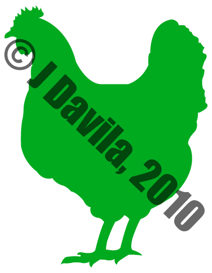
I started with the hen. This was pretty straightforward. I think I wanted to go a little less detailed with the silhouette, but...well, it is what it is! The only thing of note that I can think about with this design in particular is the change I made with the legs. If you haven't noticed, this design is not a perfect copy of the reference image I have linked above. The first silhouette was, but that rear leg just bugged me to no end, so I chopped it off!...and then copied the forward leg, dragged it back a bit, played around with the orientation and there you have it! I personally think it works a lot better now.

Next, we have the piggy! Same as the hen, It was pretty straight forward, but I feel like it's the least detailed of the bunch. I mean, it's got a pretty plain form, but I guess I can blame the reference image for that. Same as the hen though, I altered it as I saw fit to get the message of "Hey, it's a pig!" across loudly and clearly. The more obvious of the two is the third leg back. If you note the reference image, you'll see that its hind legs are close together. That just wasn't working for me, so I took the first leg, added more leg to it and moved it back into place. The next change (which I consider the least obvious, but it probably depends on the individual viewing it) is the extra piggy ear. In a true silhouette of the reference image, you wouldn't see that second ear, but this was something else which I felt would help solidify that this is, in fact, a pig. So, there you go!

And last but not least, we have the cow! This was a little tougher to get done in a simplified enough manner. On one of the initial runs (I have to create an outline for these from start to finish, and it's difficult going back and fixing something midway through) I was going too detailed so I had to start over from the start. Later I realized that I didn't have a clear view of the hooves, so I had to leave those alone, find a separate reference image for cow hooves and then return and make some while playing it by eye. So yeah, those hooves are a definite edit made by me that wasn't found in the original reference image. Next, is that utter to the left. As you might have noted, there's a calf suckling the one in the reference image, so I had to play around a little with that. That's about all I did with the cow design.
Next I created a triangle, played around with the distances from animal to animal, and then with the distances in between the animals and the horizontal dividers...and then with the sizes of the animals and the width and height of the triangle itself. Getting it all sized and spaced to where it felt good and right was a pain in the ass! That problem took the most use of my braincells (I might have even stopped the music from playing on my iTunes so I could concentrate, haha). So, here is the finished product!

As you might be able to tell, the animals are not perfectly centered, but that's because it felt wrong when they were. The alignment I used was by eye and based on the proportions of them instead, and I think it worked much better. There was just something...unnatural about having them in a symmetrically centered fashion. Even though the designs were centered, their weight wasn't. Also, I mirrored the cow to face in the opposite direction. It would have been weird having both the pig and cow facing the same way in sequence when the hen wasn't, so I alternated them all by simply having the cow face left. I actually just got a version (I chose a red pyramid with white animals) of the t-shirt in the mail a few days ago and it looks great (this photo doesn't do it justice, but I have no better lighting to work off of. Also, the pyramid really is red, but the light is reflecting off of it and making it all kinds of different colors in the photo).
In relation to the "disclaimer" calling y'all pervs at the start of this post, it's related to something that happened the same night I received the t-shirt. I had a friend over, and before leaving to have dinner she jumped in my bed and noticed it laying there, so I took it and hung it out in front of me for her to get a better view and said "I call it...the 'Meat Pyramid'" but before I could say another word, she replied "You should make it have a huge cock at the top instead of that chicken!" (typical), so I told her "That would match your diet very closely. I'll be sure to make one like that just for you..." in my most sarcastic tone.
With that in mind though, I have considered making alternate meat pyramid designs (no...not with cocks), but have come to the conclusion that these animals are satisfying enough eats for now. Maybe, in the near future, I might get a clearer vision concerning other alternative food pyramids to design, but for now this is all I got! Interesting to note is that this design is still the only one that comes up when one searches for a "food pyramid" on Spreadshirt. I think that's pretty cool!
Well, that's all I have to say on this design! Remember to swing by my designer shop from time to time, as new designs will continue to drop in irregularly. Now go on, get out of here...git!
J, out....


